Behind the design with Kara Hobbs Design: A soulful family space

Sedona wallpaper in this interior by Kara Hobbs Design (photo: Cate Black)
I create from a space deep within…from the soul, you might say. My highest aspiration for my work is that it speaks to someone on a soul level, and completely changes the way they experience their space.
Quite often, I don’t even get to see my work installed. Only occasionally do I have to opportunity to connect with the lovely designers and homeowners who choose my designs. Yet once in a while, a special project comes along. This is one of those projects.
I caught my first glimpse of designer Kara Hobbs’ vision in June, when she posted a moodboard and flat lay on Instagram. Aside from being psyched to see one of my new wallpapers included, I loved the unique aesthetic that brought together a soft, primary-ish color palette, mid-century vibes, and curved lunar accents. It felt perfectly balanced between retro and modern.
Installation shots popped up a few months later, and I received messages from both Kara and her client expressing how much they loved the wallpaper. Then, just a couple weeks ago, Kara shared the completed installation. The warmth of the space and of its inhabitants just came through, and I knew I wanted to learn more about the story behind this design. Below, Kara Hobbs shares some wonderful insight into her design approach for this project.

Interior: Kara Hobbs Design / Photo: Cate Black
KM: What was your vision for this space?
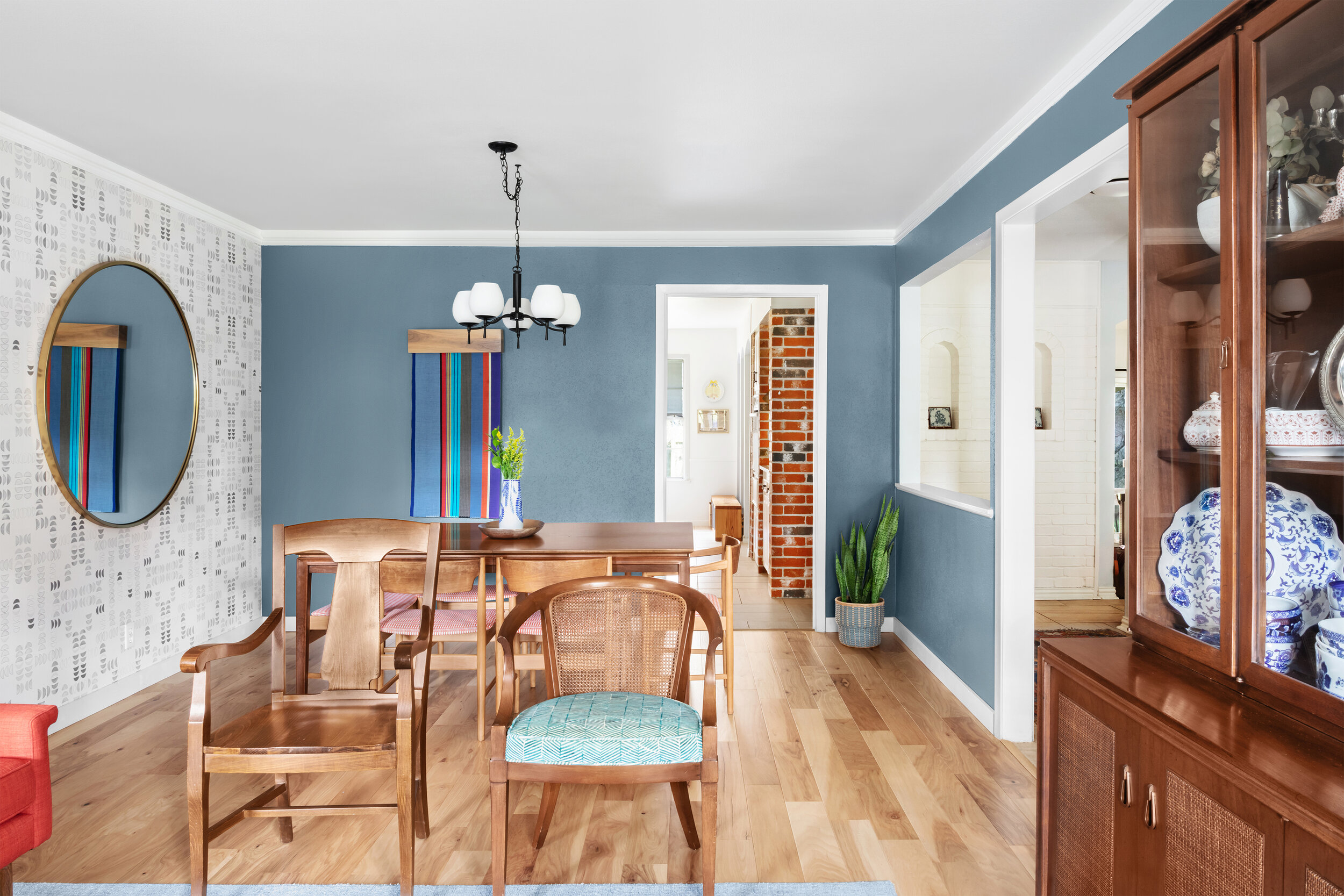
KH: I wanted to create a space reflective of the warm and vibrant family living there. Since it is the very first space you see when you walk in the front door, my goal was to make it inviting and energetic with playful layering of pattern and color. The design was rooted in the client’s collection of family heirloom pieces, vintage furniture they love, and the colorful palette of a treasured tapestry from New Mexico now featured on the dining wall. I also wanted to create a sense of cohesion and efficiency since this is a combination space with two distinct functions.
KM: What drew you/your client to our Sedona wallpaper for this project?
KH: Generally, grayscale patterns are my favorite addition to any design. I was drawn to the hand drawn look of the lines in the pattern and the airy, lunar theme. The icing on the cake is that this selection is a fun nod to the family’s passion for walks under the moon. The scale of the pattern is just right to engage, but not overwhelm, the eye. I think the design of this paper also vibes well with the midcentury style furniture pieces in the space.
KM: Was sustainability and using eco-friendly materials a factor in this project?
KH: As with most of my projects, I look for ways to repurpose and/or reinvent the client’s current pieces to suit the new look and feel of the space. I also love scouting the vintage shops here in Austin for new-to-you furnishings and décor.
KM: What effect does the wallpaper have in the finished space?
KH: The wallpaper simply makes this room! It is the reason the space feels bright, fun, connected and a little extra sentimental to the client. The crescent shapes in the pattern complement the round design elements, as well as the arch forms in the sight lines adjacent.

Kara posted the big reveal just last week, and included this quote from her client:
“It’s given us a pleasant place to read on the weekends, a special place for Shabbat dinners, the best Zoom background anyone could ask for, and it’s made walking through our front door a joy rather than a drag. Now it’s far and away the best part of the house.”
These words from Kara and her client make me feel like Thanksgiving came early. Thank you so much Kara for sharing this insight into your design process. I look forward to working together on future projects!
